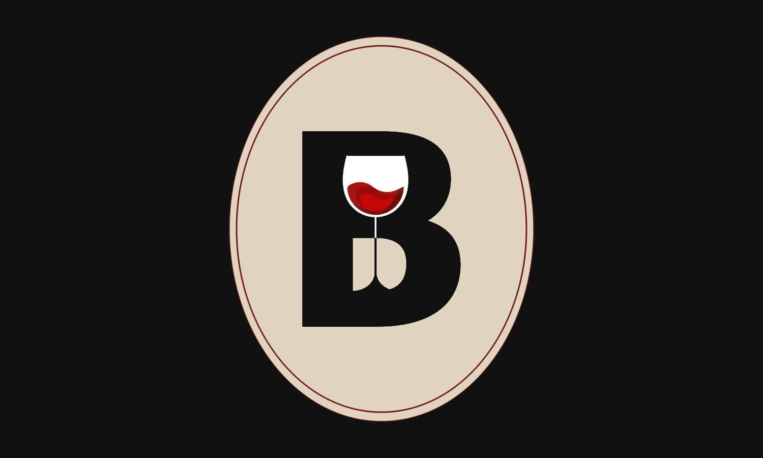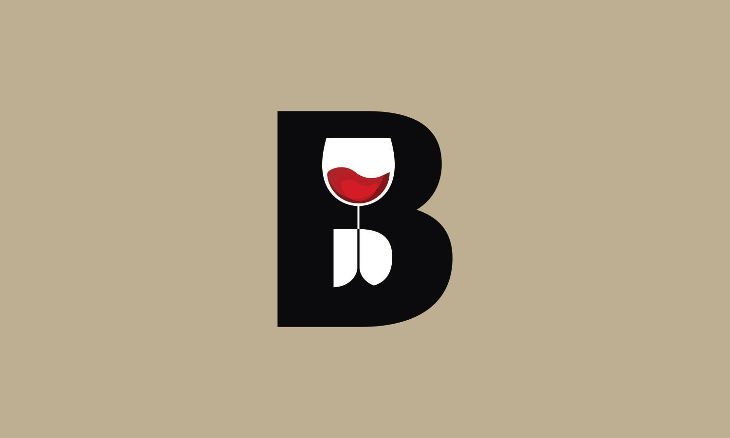
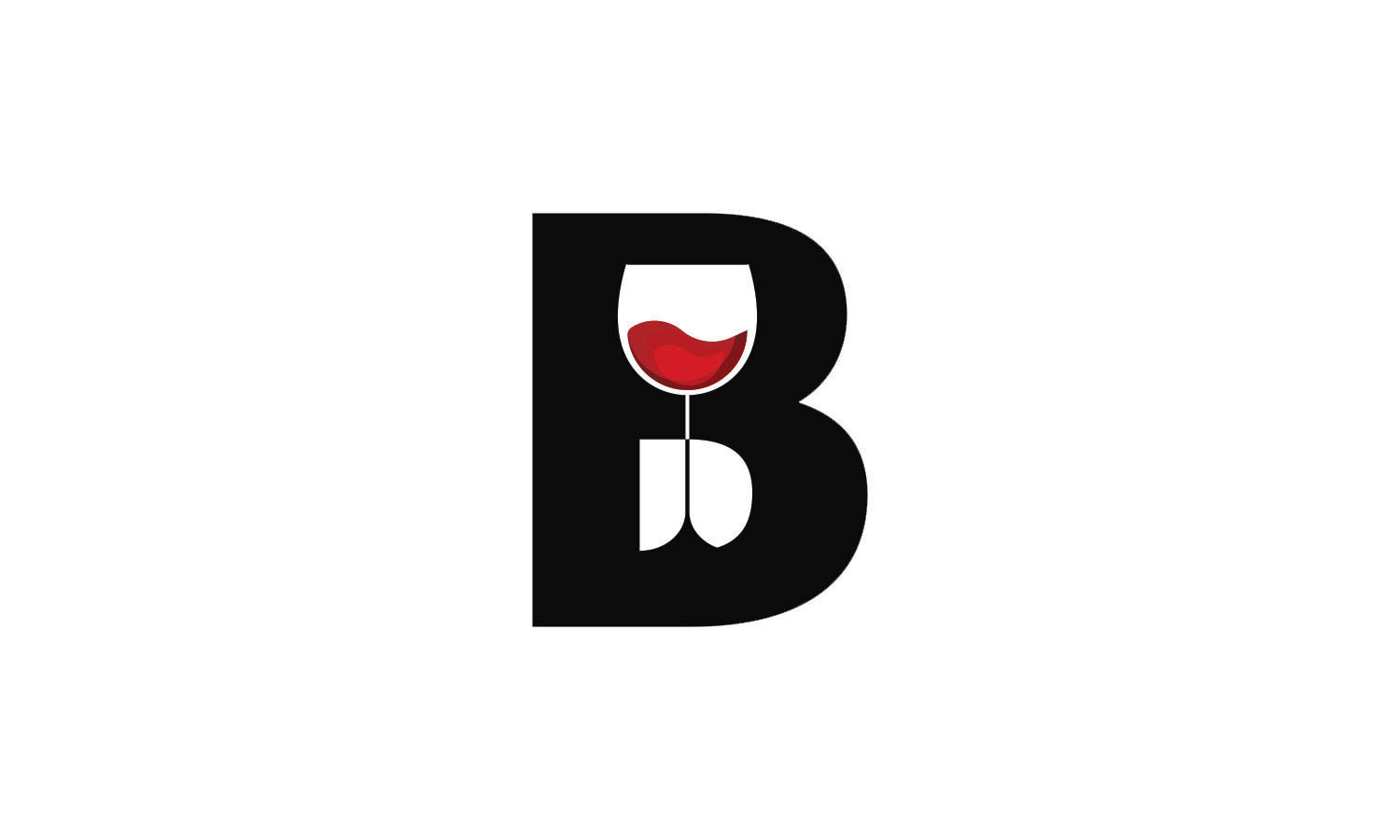
The bold “B” letterform is complimented by the delicate wine glass constructed in the negative space. The shape and shades of red used for the wine in the glass give the logo movement
as well as serve as the focal point of the overall composition.
as well as serve as the focal point of the overall composition.